
We live in an age where how you leverage data is becoming paramount to growth and survival. Businesses that thrive have total visibility into their operations and can make strategic decisions to scale up or down at the right time based on sound logic and accurate numbers.
Today, standard financial and operational reports are not enough to manage productivity and profitability. There are other tactical measures of performance that should be regularly assessed, tracked, and analyzed to stay on target or adjust to change. It’s why more and more companies are investing in data management, reporting, and business intelligence tools. In particular, Microsoft’s Power BI, known for its exceptional data visualizations and performance-driven dashboards, is on the rise. With the right pieces in place, Power BI can help you integrate your data and transform it into an easy-to-digest format for instant analysis and impactful decision making.
Here at Tigunia, our data management and analytics experts spend their days helping customers turn their raw business information into meaningful Power BI dashboards they can use every day to track their company’s health, proactively monitor business processes, and capitalize on opportunities through analyzing large volumes of data.
To help guide your organization’s performance management practices and better predict outcomes in 2021, we have put together a guide on the make-up of an effective Power BI dashboard, a dashboard preparation template, and 3 essential Power BI dashboard examples to adopt this year.
The Anatomy of an Effective Power BI Dashboard
The purpose of any business dashboard is to help you quickly and easily decipher raw data. The easier to read a dashboard is, the faster your people can interpret that data and make decisions. Power BI has a reputation for producing clear and simple to understand dashboards thanks to its capability of delivering visually stunning results. But with a wide range of pre-built dashboards and visual elements, functional dashboard design in Power BI can be a complex process if you don’t have all the groundwork in place. To help you with this, we’ve put together a step-by-step guide, including a simple Power BI dashboard preparation template:
Establish the “Why”
To avoid producing a confusing dashboard that nobody wants to use, it’s imperative first to get a clear idea of what you’re building by establishing the goal you want to achieve or question(s) you want to answer through the dashboard. Don’t haphazardly gloss over this step; thoughtfully answer it, and let it be the driving force behind what you include.
Identify the “What”
Now start to layout the data you need to see to accomplish your “why” by listing the KPIs (key performance indicators) and metrics you should include, along with how you will need to break those down or filter them. For example, if you are a sales manager and your ultimate goal is to close a certain number of deals and increase revenue by a specific percentage within a particular timeframe, ask yourself what you and your team need to see and understand to help you facilitate that aim. You probably need to track pipeline to sales goal metrics, and other KPIs like number of deals closed and monthly recurring revenue to get a basis for performance. You may need to “slice” those metrics by item or offering, salesperson, region or territory, month and year, etc. Do you also need to see trend data on your customer buying behavior, such as what is being purchased, and when?
Define the “Who”
In this preparation phase, it’s crucial to identify who and how you will be sharing this dashboard. Then, try to determine if the data you need should be in one or multiple dashboards based on the people planned to use it and how it will be consumed. For example, if the intent is to share the dashboard with the sales team to inform and motivate their activities, but that team is mainly mobile, it might make sense to break up the information into smaller pieces. Perhaps, a dashboard for current sales performance and projected performance based on pipeline and reoccurring revenue, and another for consumer buying trends by item, timeframe, and region.
Sketch Out the “How”
Once you have those first three vital elements defined, you should start to consider what visual elements will help communicate your goals and performance metrics effectively. The colors, images, buttons, fonts, and charts you use in your Power BI dashboard should always look and feel consistent and align with your goals. Power BI includes a ton of incredible pre-built templates and visual elements to work with, but it can be overwhelming. Here is a quick overview of some of the visual elements that you should be familiar with before getting started:
- Table = A tabular visual similar to tables in Microsoft Excel, with formatting and modification options
- Card = A card that contains a single number
- Matrix = Power BI’s equivalent of a pivot table
- Map = Interactive map visuals to show distances and locations
- Charts = Multiple chart options include Line, Pie, Area, and Column
- Slicer = Visual filters for a chart to highlight data
- KPI = Key performance indicators visually show your progress against a goal
You can also use Power BI’s pre-built custom visuals for better filtering options, detailed charts, interactive drill-down capabilities, and industry-specific visuals. You don’t have to marry or commit to a visual element in the preparation phase; jot down ideas while thinking of the best way the people who will use the dashboard can consume its information. Sometimes you find that one visual approach works or fits better over another as you actually build it.
Power BI Dashboard Preparation Template
Although it can be tempting to skip a preparation exercise and dive straight into Power BI, our decades of expertise in report and dashboard building assure you that you’ll save more time by establishing these dashboard components ahead of time. Copy and paste this simple preparation template below to get started. We’ve included an example for a receivables dashboard (spoiler alert to the top dashboards you need this year), which you can replace with your own:
| Dashboard Name: | Open Receivables Balances by Location |
| Goal/Why/Question to Answer: | How much money are we owed, from who, and from where? Get a clear understanding of current outstanding balances by region to proactively manage cash flow and working capital. Who should we call first to start collections? |
| Who Will Use the Dashboard? | CFO, Finance Manager, AR Clerk |
| Metrics, KPIs, Filters | Metrics/KPIs:
Filter/Breakdowns:
|
| Visual Element Ideas |
|
The driving force behind the reporting and BI team at Tigunia is to enable self-service business intelligence at any level in an organization. To meet the increasing demand for business analytics and data scrutiny, we rely on amazing tools like Power BI and Jet Analytics to create, customize, and share valuable business dashboards for ourselves and our customers.
Check out our interactive Power BI dashboard examples that we have developed for sales, receivables, and procurement:
VIEW TIGUNIA’S INTERACTIVE POWER BI DASHBOARDS
Top 3 Power BI Dashboard Examples for 2021
With our extensive experience working with Power BI and creating custom strategy, operational, and analytical dashboards, our goal is to help you better prepare for 2021 with the insight you need. We have outlined 3 highly useful Power BI dashboards that will benefit you in the year ahead. This curated selection of Power BI dashboards, created by our team and other creators from the Microsoft Power BI Community, focuses on cash flow, customers, and operational performance to set your business up for success and growth.
-
Cash Flow Management
Most businesses struggle or fail because of poor cash flow or inadequate working capital. In a recession like the one we are experiencing right now, it’s more important than ever to start tightening your cash flow management and reducing your working capital requirements. One way to start doing that is by creating a Power BI dashboard that tracks essential metrics like current assets and current liabilities, and KPIs like Days Sales Outstanding (DSO), Days Payable Outstanding (DPO), and Days Working Capital (DWC). For more information on these areas, read the full white paper below.
How to Manage Your Working Capital During a Recession
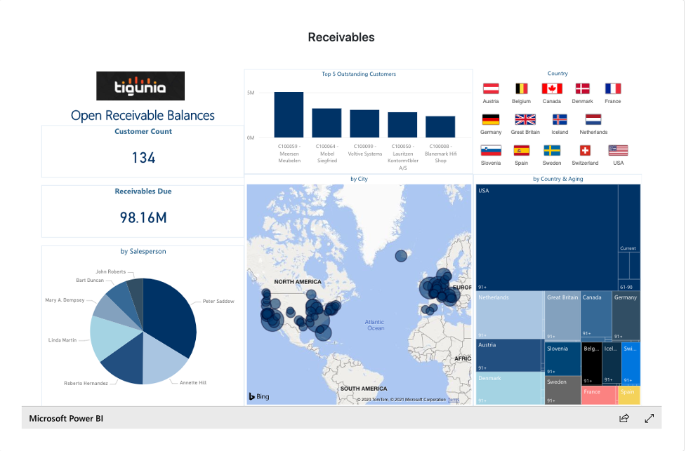
As an example, we have included our interactive Accounts Receivables dashboard. This interactive dashboard gives management insight into the current state of their receivables and progress toward organizational goals. In this dashboard, you could customize it by adding a bar chart to show Days Sales Outstanding (DSO), Turnover Ratio, or Collections Effectiveness – whatever metrics are most relevant for your business.
-
Customer Analysis Dashboard
Having a thorough knowledge and understanding of your customers and sales is essential to survival in today’s rapidly changing environment. A Customer Analysis dashboard in Power BI can deliver valuable insight into sales and profit while enabling fast analysis of business growth and strategic revenue-generating decisions. To customize your dashboard, you can pick an assortment of metrics like total sales, total profits, last year’s sales, and percentage growth and filter based on specific channels or years.
Customers can use charts to compare total sales and profit margins and analyze client segmentation and product performance.
The example below is a Customer Analysis Dashboard created by InfoCepts. It uses charts to compare total sales and profit margins and analyze client segmentation and product performance.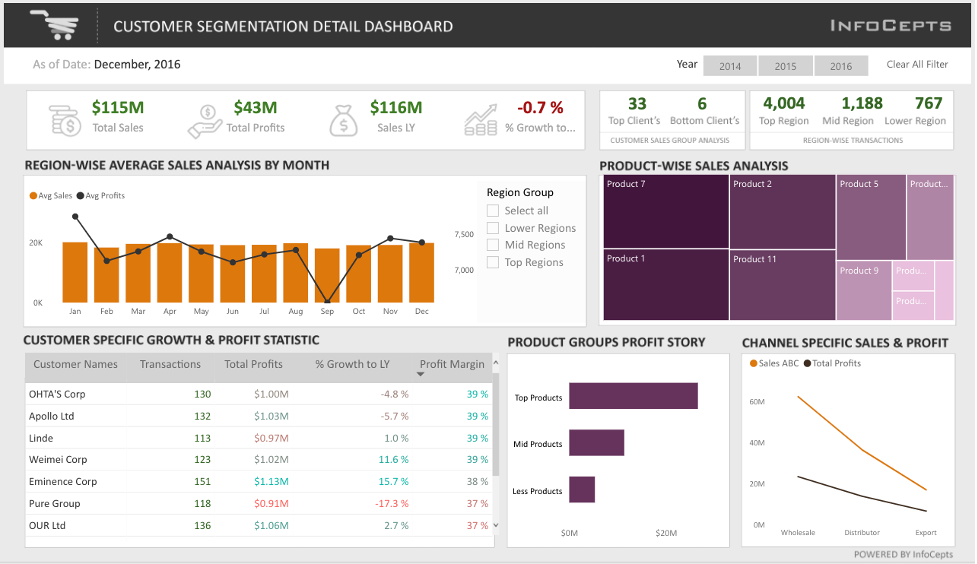
-
Executive Insights Dashboard
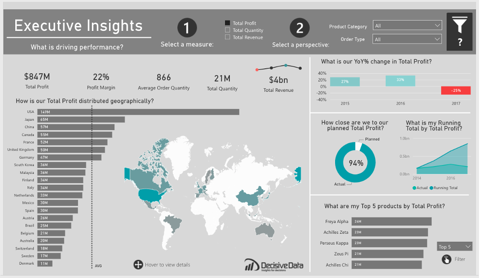
To strategically guide the direction of your organization, the executive team needs to have total visibility into business health and performance. If you’re ready to improve the speed at which you make data-driven decisions, it’s time to start building a custom Executive Insights Dashboard in Power BI.
In the example below, Decisive Data has created an executive dashboard that can help you view your business from multiple angles. It looks at what you are selling (products) when you are selling (year), where you are selling (country), how you are selling (order type), and includes deeper analysis such as Year Over Year (YOY) growth, Average Order Quantity (AOQ), and Running Totals.
Start Building Effective Power BI Dashboards
If you are serious about creating meaningful dashboards in Power BI, we can help. Tigunia’s business intelligence team has the training and support options not just to help you create custom Power BI dashboards that fit your business and goals this year – but to equip your users with the skills to do it themselves.